Crunch
Challenges
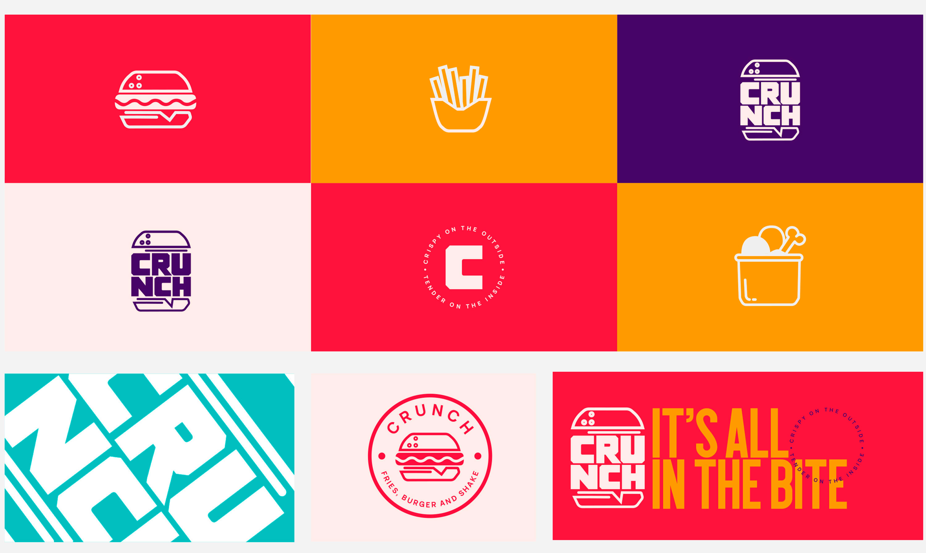
The challenge for Crunch in the fast-food restaurant market from a branding perspective is to create a unique and memorable brand identity that differentiates them from their competitors.
They wanted to create a fun and exciting experience all whilst capturing a young and family-based audience. The client asked the logo to include an emblem along with a name and they wanted the brand to be very 'Instagram-able'.
Solution
Three primary colours were chosen right at the beginning (Yellow Orange, Crimson, Seashell), along with three secondary colours (Maximum Blue Greeen, Persian Indigo, Raisin Black) that really made all markekting collateral stand out and pop from any environment they were placed in.
These colours along with the clean typography and photo collateral gave the brand real energy and created the fun feeling experience the client was looking to achieve.


